What makes reading online content difficult?
- Clutter
- Bad typography
- The web page not adjusting to the device
What if there was a WordPress theme that was designed from its inception to cure all three of these web reading scourges? There is. It’s called Whitespace Pro, and it’s the latest child theme release for the Genesis Framework.
What you notice first about the Whitespace Pro homepage when you check out the demo is how clean it is.
“Minimal” isn’t really the right word, because there is plenty there — including a beautiful header image, gorgeous organization of blog posts, social buttons, and more. But it feels minimal. Your eyes stay comfortable. Your readers’ will too. (This is especially true on the post pages — see how easy and inviting that is to read?)
What you may notice after that is the typography, chosen to be the perfect fit for both the form and function of the theme.
Theme Customizer
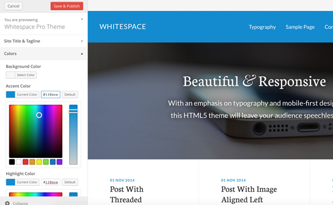
One of the most brilliant elements of the Whitespace Pro theme is that it takes advantage of the Theme Customizer that is built into WordPress.
Instead of providing a few selected color styles, we’ve given you the ability to select any color you with with just a few clicks.
Finally, you will definitely notice the mobile responsiveness. View Whitespace Pro on any device and it delivers the same impeccable experience to you — and it will to visitors of your website as well. And, as you know, a visitor who has a pleasant, comfortable experience on a website is far more likely to share, subscribe, or buy.
Whitespace Pro also comes with:
- Customizable welcome image
- Four different page options
- Various different color styles
- After entry widgets to include simple CTAs
- Author boxes after posts
And much, much more.
Go give the demo a visit and see how Whitespace Pro provides the quintessential online reading experience.
