There is no more frightening combination of words that could be uttered to a designer:
Make it pop.
Most people know when something is beautiful because there is an inherent sense of order and design that is hard wired into us. Yet those same people have a very hard time quantifying what exactly makes something beautiful.
One reason is that it takes many parts combined in a specific way to make something unique and beautiful. And typically those many parts will not be readily visible because a good design will combine them in a way to create one cohesive work of art.
Good Web Design Needs Something More
Now good web design is pretty easy to come by. There is beauty in simplicity and there are tried and true formulas with layout that just work. And if you stick to these you’ll more often than not come out of your Photoshop session with something that looks pretty good.
But if that is all you do you’ll never have a truly great design. Nobody will retweet you and it won’t be something you’ll be really proud to put at the beginning of your portfolio.
You need that one last thing, the holy grail of design, the thing that makes it pop.
Textures Can Turn Your Design Into Something Special
While I believe there are many techniques to achieve this one of the best items in my arsenal is textures. The proper and subtle use of a texture takes a design from being flat and dead to noticeable and alive.
Nowhere is this more clearly demonstrated then with Apple’s designs.
I recently upgraded my iPhone 3Gs to the 4s and its beautiful retina display. One of the first things that stood out was the beauty and detail of the icons and apps. With more pixels there can be more details and literally more parts of the whole could be included to create a better piece of art.
Compare the icons on the left with Apple’s own on the right. While the icons on the left are still good icons, the subtle use of texture takes a good design and makes it great.
Applying Texture to Your Design
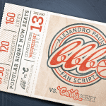
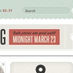
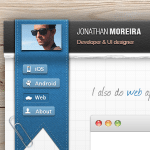
Be sensible and subtle about it. Too much of a good thing will spoil the whole design. Below you will see 6 examples of texture being used well. Use it for inspiration for your own designs!
Dribbble Credits
Dribbble #1 | Dribbble #2 | Dribbble #3 | Dribbble #4 | Dribbble #5 | Dribbble #6
Free Texture Resources
Subtle Patterns | Texture King | Zen Textures | Lost and Taken
(I think that the Subtle Patterns site is quite possibly the best site for textures in the world.)
