If you’ve watched the HBO series Game of Thrones (or have read through the Song of Ice and Fire series), you’ll know that one of the major themes throughout the story is the subtle art of politicking.
In order to survive you’d better know what your enemy’s next move will be — and be able to defend or counter it quickly.
It’s no secret that the majority of web browsing is sliding quickly over to mobile devices.
Because of this, designers and developers have been forced to confront their new handheld overlords. We’ve been given quite a few responsive weapons that have beaten back these devices including: media queries, fluid layouts, and all sorts of fun javascript hacks.
But the audience keeps showing up on new mobile devices every day.
New challenges come with each new mobile device on the scene. The good news is that we don’t need to pay attention to every single mobile device that comes out, or give fealty to their demands. But when the king of mobile devices brings a new heir into the realm? We’d do well to pay attention.
With the introduction of the new iPad and including both generations of the iPhone 4, Apple now has millions of devices in the hands of its loyal subjects, burning their retinas with beautiful, high-density displays.
The people of the realm spend hours gazing at the graphics you’ve designed on their new toys. If you haven’t designed those graphics correctly, their blurry appearance might just land your pretty little head on a pike in King’s Landing 😉
We don’t want to lose our heads over an issue that’s so easy to deal with, so squire alongside me and let I’ll show you what you can do to bring graphical peace to the mobile kingdom … for a week or two, at least.
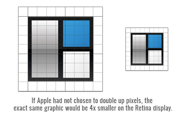
When Apple introduced the iPhone 4 and its Retina Display, they stopped measuring the screen in pixels and started measuring in points.
Each point is actual four pixels. The display blows up each pixel 2 times its size so that the physical dimensional size of the graphic stays the same — whether you are looking at it on an iPhone 4s or an iPhone 3gs.
This is important because if they hadn’t doubled every pixel, everything would have been too small to see properly. You didn’t want to have people squinting, pinching and dragging to see things they had no problem seeing before.
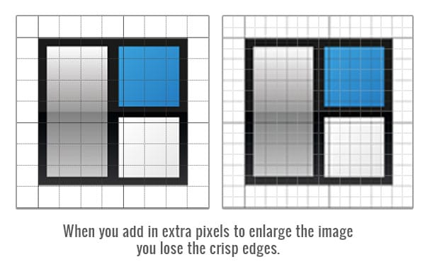
But it also created a new problem, because we know what happens when you start duplicating pixels and enlarging graphics — they get blurry. They get blurry fast.
The graphic above has been exaggerated a bit to illustrate my point.
When you look at graphics that were not specifically enhanced for the Retina Display on a Retina display, you’re not going to see a huge blurry mess. What you’ll see are edges that are not as clean as they should be, and text will be just a little harder to read.
Some would say, what’s the big deal? I can handle my edges being a little flat.
Personally, I want my graphics to look as crisp and clean as a new dollar. Aside from my own preference, ask yourself this: What if, in the next year or two, that pixel density doubles again? What if it triples? We’d have a real problem on our hands.
So what’s the solution?
One option is to use a media query to target these high density devices, creating low resolution and high resolution graphics.
[css]
@media screen and (-webkit-min-device-pixel-ratio: 2), screen and (max–moz-device-pixel-ratio: 2) {
logo {
background: url(images/[email protected]);
background-size: 130px 40px;
}
}
[/css]
Take a look at the two graphics below.
The first is our normal image, the second is our high resolution image.
Zoom in on either your mobile device or your desktop browser and you’ll be able to see that the first image will get blurry as it’s enlarged, but the second will remain nice and crisp.
This works well, but it’s a lot of extra work to produce multiple versions of all your graphics.
Ultimately it would be nice if we had graphics that could scale up and down seamlessly without losing any quality. Raster or pixel based graphics won’t do this so we would have to use vector based graphics.
One of the newer ways to do this is to use an icon font.
There are a lot of benefits to using icon fonts for graphics:
- Infinitely scaleable
- Resolution independent
- Supported by all browsers young and old
- You can design on the fly (easily change colors with css)
- Small file size
Here’s how it’s done:
- Upload your icon font file to your web server. We’re using a free one called Modern Pictograms from Font Squirrel (I’ll provide a list of great ones at the bottom of the post)
- Reference the font file in your css
[css]
@font-face {
font-family: ‘ModernPictogramsNormal’;
src: url(‘http://www.studiopress.com/wp-content/uploads/modernpics-webfont.eot’);
src: url(‘http://www.studiopress.com/wp-content/uploads/modernpics-webfont.eot?#iefix’) format(’embedded-opentype’),
url(‘http://www.studiopress.com/wp-content/uploads/modernpics-webfont.woff’) format(‘woff’),
url(‘http://www.studiopress.com/wp-content/uploads/modernpics-webfont.ttf’) format(‘truetype’),
url(‘http://www.studiopress.com/wp-content/uploads/modernpics-webfont.svg#ModernPictogramsNormal’) format(‘svg’);
font-style: normal;
font-weight: normal;
}
[/css] - Create your markup
[html]
<div><span class="icon">i</span>View Basket</div>
<div><span class="icon">a</span>Read More</div>
<div><span class="icon">(</span>Settings</div>
[/html] - Create the properties for your icons in your css
[css].icon {
color: #3090cf;
font-family: ‘ModernPictogramsNormal’;
font-size: 18px;
padding: 0 15px;
}[/css]
And here is the results…


