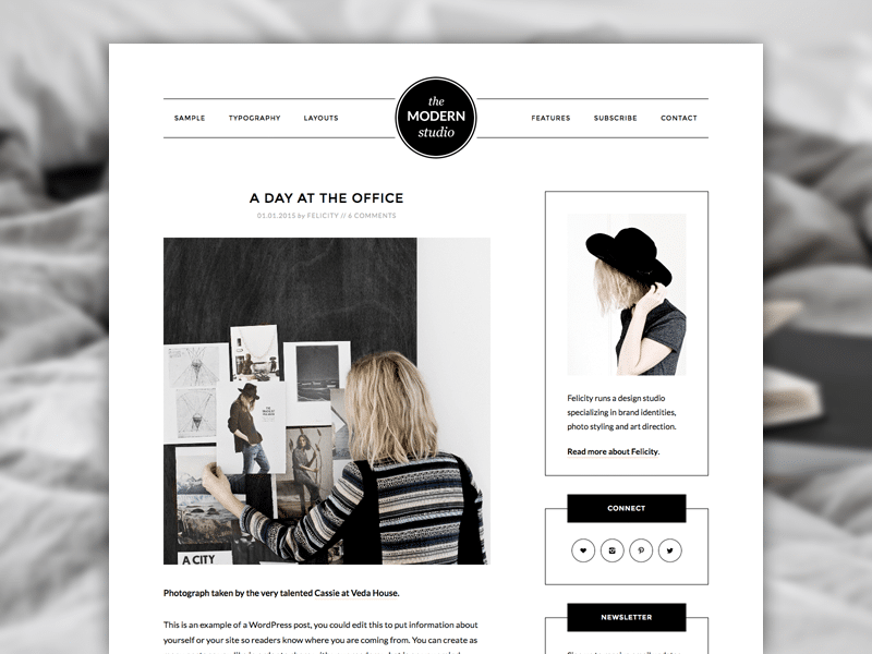
How do you deliver the freshness of your modern offline studio to web visitors who may never be able to set foot inside it?
With a website design that captures it — that has the perfect balance of image framing, information, and ingenuity for your online visitors.
The Modern Studio Pro Theme for Genesis has all three.
For designers, highlighting imagery is the most important function a website can perform. Modern Studio Pro does this by cutting back on the clutter and color, so that it’s your shutter and colors doing all the work.
Modern Studio Pro draws eyes exactly where we want them — then doesn’t distract them.
But the information still needs to be there, and it is.
Whether you need a simple navigation bar, or if you want a sidebar too, you can easily pick and choose the layout that fits the function you need your site to perform.
Plus, the hand-chosen typography makes the reading experience as effortless as your readers will desire.
Finally, something new for a Genesis child theme: a sticky message that is subtle in how it stays with your visitors while they browse your site, yet strong in conveying whatever important message you may have to deliver.
Go to the demo and start scrolling down. You’ll see what I mean.
Imagine your design studio transmitted to the web. That’s Modern Studio Pro for Genesis. All it needs is your unique touch to become your own.
