Responsive web design is all the rage.
Everywhere you look — including StudioPress.com — designers and developers are touting this site or that theme as responsive.
In fact we’ve got our own responsive design testing tool.
Big names like the Boston Globe and Sony have gotten on the responsive web design train, and every list of web trends have responsive design as the de facto standard trend for 2012.
But what makes good responsive design?
We’ve shown you how to create responsive design utilizing flexible grids and media queries, but beyond those what elements are required to really make a design stand out and be useful to your clients and readers?
I believe it all comes down to:
- Changing your thinking
- Understanding how to organize your content
Let me explain…
A Change in Your Thinking
The web has moved beyond the desktop, and it’s not turning back.
-Ethan Marcotte, Responsive Web Design
The first element to excellent responsive design is to embrace it wholly and change your thinking.
While most people agree that responsive design is not magic fairy dust that will solve all of your multiple device usage problems, it is the best thing we have right now — and its only getting better.
In order for your designs to really reach their true potential you have to start thinking responsively from the outset. This requires — in my opinion — a need to change your workflow, and have a philosophy of designing for the mobile device first.
In his article Redefined, Trent Walton states:
To design responsive websites effectively and responsibly, I had to completely redefine the way I view the web.
The process of comping everything out in Photoshop first is quickly becoming more of a burden than benefit. In the past HTML and CSS were used to realize the vision that was produced in Photoshop. The problem is that this only works for one view — the desktop.
In reality we have a choice: either design multiple pixel perfect layouts in Photoshop or move the majority of design/layout to the browser and use Photoshop for the graphical elements.
It’s the idea that you are not building a web “page” anymore but rather a “network of content” that can be arranged and displayed to show it off in the best way possible, no matter where it is being viewed.
I truly believe that progressive enhancement is the key to building web sites today — not only for CSS, but for your content design and layout as well. We should start designing for the mobile device and its constraints, and then allow the site to grow.
In his book Mobile First, Luke Wroblewski, one of the foremost voices on mobile design today has this to say about the benefits of embracing a mobile first philosophy.
It not only prepares you for the explosive growth and new opportunities on the mobile internet, it forces you to focus and enables you to innovate in ways you previously couldn’t.
The mobile revolution is here and its not going anywhere. If we as designers don’t adapt and change our thinking, you’ll be easily replaced by those that do.
Organizing Your Content
The biggest benefit to responsive design is the ability to adjust the layout of your content — and in certain cases, the actual content itself — to fit your user in their environment.
It does your users a great disservice if all you do in your responsive design is move your sidebars under everything else. Creating excellent responsive design means you have to think through the context in which the user will be interacting with your content and adjust it to meet their needs.
For example, most people on mobile phones will not be surfing to your site randomly. Most likely, they followed a link to view a specific piece of content on your site.
At that point they have no interest in your navigation menu that takes up the entire screen, or your huge, full-width search box. And while it may not seem like a big deal, this is where responsive design really shines.
You have the opportunity to present to those users what they want in a way that is attractive and easy to read.
What follows are several case studies of sites that are organizing their content responsively while keeping user interaction as a primary focus.
Case Study – Sony USA
One of the biggest problems people are having a hard time solving with responsive design is what to do with the navigation menu. It’s obviously important, but as I pointed out earlier, on a mobile device it can get in the way of a fluid reading experience.
For sites with just a few navigational items it’s not as big of a deal because you can often place them on one line, where its not taking up too much screen real estate. But what if you have a large site with lots of sub-menus?
Most responsive sites have chosen one of two routes: they either hide the menu altogether with javascript and then allow it to appear on press, or they move it to the bottom of the content and have an anchor attached to it at the top.
The first option is definitely preferable. I can’t tell you the number of times I’ve tapped a menu button to see what is offered only to be jumped to the bottom of the page. You then find yourself swiping your way back to the top of the page. That’s bad user interaction.
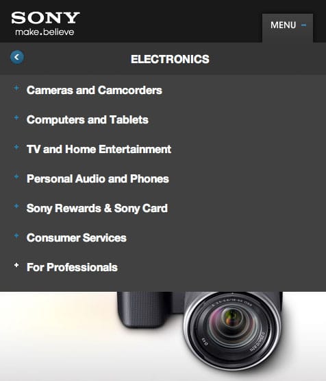
The Sony site has — in my opinion — the best responsive menu for a mobile device.
They’ve taken their menu and placed it in a single button next to the logo that expands on touch. The best thing about this menu is that it mimics a native app, and when you select a top level menu item with a sub-menu you’re taken directly to that sub-menu with a back button.
There are a number of advantages in executing the menu this way:
- The content behind the menu remains, even if the reader decides to abandon the menu
- The user does not have to swipe around to see all the menu items
- The interaction process is one that is familiar from a native app
Case Study – CSS Tricks
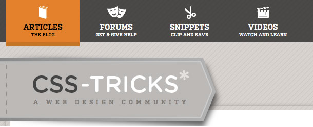
The CSS Tricks site also has a very well thought out navigation menu that takes into account both the device and situation that the reader is in.
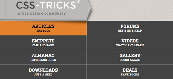
In widescreen, the navigation menu uses up a good amount of horizontal screen space. Since it has more space to use, it progressively enhances and includes a helpful description of what each link is about.
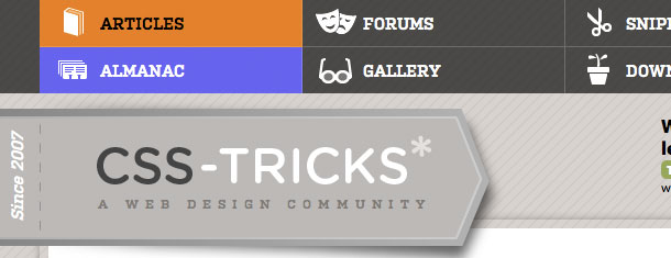
When the screen width goes under 960 pixels, the navigation does a very smart thing that a lot of sites get wrong — it doesn’t get smaller as the screen does, but splits itself onto two lines.
The font is the same size, the icons are same size, and everything is still very selectable by touch.
At 860 pixels and under the navigation still does not get smaller, but instead chooses to eliminate the icon and gets taller, which is also better for a touchscreen user.
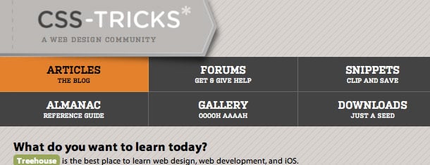
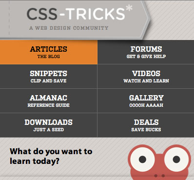
600 pixels is the final break point for the navigation and now breaks itself into two columns.
Notice that the navigation items have only decreased in physical size sightly, and still give the reader a good experience to select.
One other bit that shows the designer was really thinking about the user is the view in portrait mode on an iPhone. The logo, nav menu and ad fill the screen exactly to the pixel.
You’ll also want to check out the “easter egg”, and watch the clever ad for Treehouse as you decrease your browser width.
Case Study – Smashing Magazine
One of the negative examples I mentioned earlier is that a lot of developers are making their sites responsive simply by shoving their sidebars under all their content.
Smashing Magazine does a good job in managing the content in the sidebars in a responsive way.
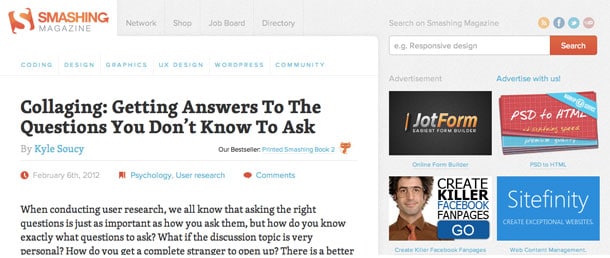
Their site employes a three-column layout with a navigational sidebar on the left and a sidebar on the right that houses ads, featured articles, and other content.
In the widescreen layout, they take advantage of modern wide browsers as the site expands to a maximum of 1800 pixels. This is a great use of screen space because as screens grow wider, their primary content — articles — gain the extra space.
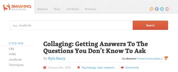
At 1220 pixels the navigational sidebar re-locates above the main content.
This might be the only place where I disagree with their content placement decision. 1220 pixels is still fairly wide and I can see a user wanting to have content navigation available as opposed to ads. Obviously, the bills need to be paid and that needs to factor in, but from a consumer’s perspective I think it’s a mistake.
1010 is the next break point. Here the subnav menus come back and the ads disappear.
This is a calculated move to have the content fit beautifully on a tablet device. Knowing that most consumers that fit in this screen width are probably using a tablet and are intent on reading, they made the decision to remove the ads and focus on content and navigation.
The last break point at 610 pixels assumes that all users will be using a handheld device and coming to read a specific article.
They remove the top navigation bar — as well as the social icons — and condense the main navigation menu into a drop down.
4 Final Questions to Consider
I would encourage you to think through your responsiveness as much as you would think through any other content layout decision.
For responsive design to do what it’s truly capable of, we need to change our thinking and change how we organize our content.
Ultimately it comes down to choosing what content you want your users to experience, in their own context? In his chapter on organization, Luke Wroblewski offers four principles that every designer and developer should when considering responsive design:
- Have I thought through how people will use their mobile device on my site?
- Have I placed an emphasis on my content (as you should) rather than graphics or navigation?
- Have I provided relevant options for exploring and pivoting?
- Has my design and content maintained clarity and focus?
