The team here at StudioPress works hard to constantly create the very best premium WordPress child themes on the market.
However, we often pause to marvel at what others are accomplishing through their creative uses of the Genesis Framework for WordPress.
We take our hats off to some of our favorite designs currently out there on the web that utilize the power and flexibility of the Genesis Framework and our themes.
Here are six of those amazing sites, in no particular order …
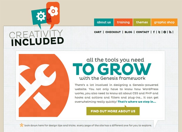
Creativity Included
With a simple, colorful site design that truly pops, Creativity Included introduces an inventive set of products and services aimed squarely at making life easier for those who aspire to customize or design great child themes for the Genesis Framework.
Creativity Included makes good on their name and offers memorable graphics and easy to navigate categories that make learning design tips and tricks a snap for anyone interested in effectively harnessing the power of the web. They also sell their own StudioPress themes.
They don’t sugar coat their ebooks, video tutorials or content-loaded classroom experiences because they know that to get the most out of Genesis, some perspiration is required. They also understand that with Genesis there are “…no limitations but your imagination.” Go ahead, dream big.
Designed by: Chris Ford
Eat Life Whole
Eat Life Whole really takes the power of Genesis to new heights with their enlightened take on a nutrition and lifestyle website that offers “nutritious solutions for body, heart and mind”.
The clean, uncluttered look of the site offers a rich reader experience that utilizes the flexibility of Genesis by offering lots of content with image-rich design.
Multiple product and consulting offerings are easy to navigate and the blog is filled with an array of helpful categories for healthful living advice. With their utilization of savvy email signups and social media widgets Eat Life Whole has a spacious feel and overall enriching design, which matches their philosophy perfectly.
Designed by: Bill Erickson
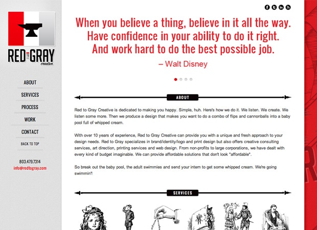
Red to Gray Creative
Red to Gray Creative proves that a minimalist design with some innovative customization can do a lot more … with less. Their site shows that the flexibility of the Genesis Framework can truly work with any unique website, especially those designed for expressing a strong point of view.
Every pertinent detail about their services and creative processes are reduced to simple, easy-on-the-eye graphics that show off their distinct style. And the clever placement of social media widgets blends seamlessly with the overall design.
Even though the team at Red to Gray Creative wear a lot of hats, the elegant and uncluttered look and feel of their site frame their services brilliantly. Kudos to them for showing us all how it’s done.
Designed by: Lauren Mancke
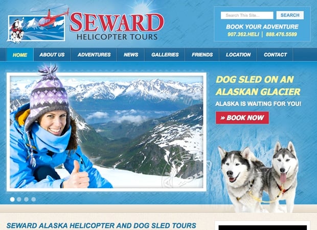
Seward Helicopter Tours
Choose your own an Alaskan adventure with the bright, refreshing website design of Seward Helicopter Tours. They use a portfolio-style homepage and photo slider to tell their breath-taking story.
By offering a content rich site that utilizes both photo and video galleries and multiple topics to highlight their helicopter and dog sled tour services, they present the great outdoors with adventurous and passionate design.
Genesis and Alaska have never looked more appealing together than with the website’s wide-open feel and airy color palette. The smart use of footer widgets, social media links and testimonials truly enhance the client and reader experience. “Book Your Adventure”!
Designed by: Sundog Media
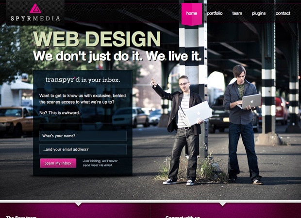
Spyr Media
With a sleek, modern portfolio-style design, the designers at Spyr Media have taken Genesis a step beyond by keeping it simple, yet showcasing their talents with some great tongue-in-cheek humor. Their credo is “We don’t just do it. We live it.” And they have photos to prove it.
Not ones to take themselves too seriously, they have wisely placed an emphasis on building email opt-ins and word-of-mouth business for their inspired work. The image heavy site is simple, savvy, and easy to navigate with a layout that focuses on communication and contacts.
Less hype means more personality for these designers and it comes across with the use of footer widgets for encouraging direct conversation about Spyr’s services.
Designed by: Spyr Media
The TomKat Studio
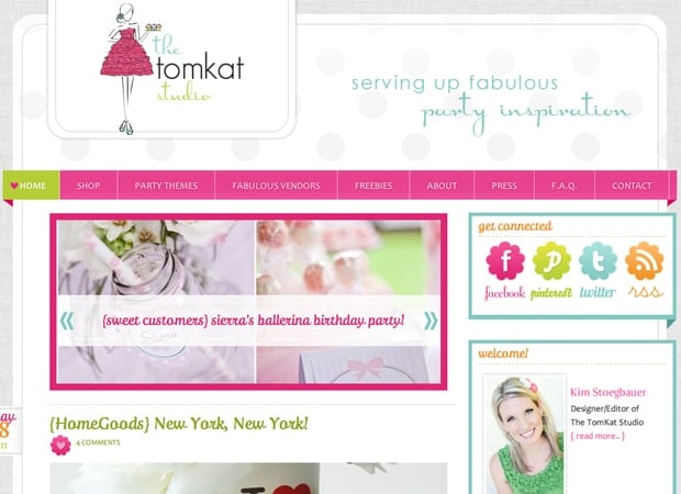
The TomKat Studio offers up some eye-popping sweetness with their incredibly useable Tumblog style site, that offers decorating and party ideas with a host of related Etsy products and services you can use for any celebration.
The bright and crafty design of TomKat Studio enlists some innovative sidebar widgets that give readers and clients easy access to more of the wonderful confections this team of designers have to offer and recommend.
The site’s 10-post homepage harnesses the power of Genesis by encouraging easy exploration of a multitude of categories and opens up the discussion with a great comment functionality. And you can “Pin” all of your favorite ideas easily with the utilization of the Pinterest widget. Very smart.
Designed by: Lindsey Riel
What have you done with Genesis lately?
Have you done some great work with your Genesis website? Have seen some great Genesis-based sites out in the wild?
Let us know in the comments below, we’re always looking for ways our customers are taking WordPress further with Genesis.
And, pop over and say hi to the people above when you get a chance.
