Today we’re going to have a little fun.
I’m going to show you how you can use CSS transitions and sprites to make the logo in your Genesis theme fade in and out when you hover over it. If you’re using a modern browser, go ahead and preview the final product below.
This is one of those cool little details that works really well with progressive enhancement. It isn’t an essential feature — since it won’t work with IE9 and below — but it can add some some nice flair to your site when used properly …
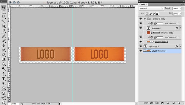
The first step is to create our logo sprite. If you need a short primer on what sprites are, check out our previous article on the subject.
I’m not going to detail all the Photoshop instructions since every logo will be different, but the basic idea here is to increase your canvas size, duplicate your image, and desaturate that duplicated image.
[download id=”23″]
When you have your logo sprite ready, upload it to your theme folder. It’s normally easiest if you stay with the Genesis naming conventions and use the name “logo.png”.
Open up your style.css file and find the section that deals with the header image. Since we’re using the eleven40 theme as our example, it starts on line 216.
This is the CSS that’s currently there:
[css]
/* Image Header – Partial Width
———————————————————— */
.header-image #title-area,
.header-image #title,
.header-image #title a {
display: block;
float: left;
height: 90px;
overflow: hidden;
padding: 0;
text-indent: -9999px;
width: 265px;
}
.header-image #title-area {
background: url(images/logo.png) no-repeat;
}
.header-image #description {
display: block;
overflow: hidden;
}
/* Image Header – Full Width
———————————————————— */
.header-full-width #title-area,
.header-full-width #title,
.header-full-width #title a {
width: 100%;
}
[/css]
And this is our current html.
[html]
<div id="title-area">
<h1 id="title">
<a href="#" title="Genesis Test">Genesis Test</a>
</h1>
<p id="description">Just another WordPress site</p>
</div>
[/html]
We’re going to accomplish this by layering our background image on top of itself.
The full color version of the image will be on the bottom in the containing div, and the desaturated version will be in the anchor on top. Since we’re using a sprite and only one image we’ll use CSS to adjust the position so that the correct image shows in each place.
Once the images are in place we can use an opacity transition to fade out the desaturated background image in the anchor, which will reveal the full color image in the containing div.
Here’s the updated CSS:
[css]
/* Image Header – Partial Width
———————————————————— */
.header-image #title-area,
.header-image #title,
.header-image #title a {
display: block;
float: left;
height: 90px;
overflow: hidden;
padding: 0;
text-indent: -9999px;
width: 265px;
}
.header-image #title-area {
background: url(images/logo.png) -266px 0 no-repeat;
}
.header-image #title-area a {
-moz-transition: opacity .6s ease-in-out;
-o-transition: opacity .6s ease-in-out;
-webkit-transition: opacity .6s ease-in-out;
background: url(images/logo.png) no-repeat;
display: block;
height: 100%;
transition: opacity .6s ease-in-out;
width: 100%;
}
#title a:hover,
#title a:focus {
opacity: 0;
}
.header-image #description {
display: block;
overflow: hidden;
}
/* Image Header – Full Width
———————————————————— */
.header-full-width #title-area,
.header-full-width #title,
.header-full-width #title a {
width: 100%;
}
[/css]
We really only changed a couple things …
We added background positioning for the sprite in the #title-area div:
[css]
.header-image #title-area {
background: url(images/logo.png) -266px 0 no-repeat;
}
[/css]
And we added in transition and hover properties for our anchor element:
[css]
.header-image #title-area a {
-moz-transition: opacity .6s ease-in-out;
-o-transition: opacity .6s ease-in-out;
-webkit-transition: opacity .6s ease-in-out;
background: url(images/logo.png) no-repeat;
display: block;
height: 100%;
transition: opacity .6s ease-in-out;
width: 100%;
}
#title a:hover,
#title a:focus {
opacity: 0;
}
[/css]
One last note: If you don’t have widgets in your header, you may need to adjust the width property for the .header-full-width div to match the width of your background image.
And, if you need some additional inspiration, check out these examples:
My Blog – joshbyers.com
United Pixel Workers
Google Chrome Logo
Enjoy!
