I love to go on dates with my wife, but but there is one moment I detest.
It’s the moment I’ve chosen a pant and shirt combination and she’s ready to see me for the first time. As I walk up the stairs – or as I call it, “the climb of shame”, I always pause in front of our bedroom door and take a deep breath because I’m sure the next thing I will hear will be…
Is that what you are going to wear?
One of the trickiest things to do when designing a web site is to come up with a good color scheme and apply it in a fashionable way. There are times I’ve spent way too much time fretting over whether the colors I have chosen will work. Much like when I put on pants and a shirt, I have this irrational fear that not only will they not match, but the combination will be so hideous that it will cause a rift in the space time continuum.
The good news is that color theory and good color combinations have a foundation in math, so with a little knowledge, and the right formulas, you can be absolutely sure your colors will match and you don’t have to worry about your client asking if that is what their website is going to wear.
Color Theory 101
We’re not going to go all MIT with this – I just want to give you 3 simple color relationships and a few tips you should know and can use right away.
Analogous – These are colors that have matching hues. They are harder to use well because they can overpower each other if used too much but since they tend to be vibrant you can have a very color rich and interesting site.
Monochromatic – There is a focus on one color but the intensity and lightness varies. This color scheme is typically the easiest and safest to use. You can very rarely go wrong when implementing this color scheme.
Complementary – Two colors opposite of each other on the color wheel. This color scheme is the middle ground between monochromatic and analogous. It gives you more visual variety but isn’t as hard to implement.
The Weapon of Choice
So I know what you’re thinking. “Sweet! now I know some color theory, but I still don’t know those formulas you were talking about.” Thankfully, people much smarter than me have put together some incredible tools for you to use. My favorite is Adobe Kuler.
Now you can go to the site and browse a lot of great color combinations that others have created, and if you’re stretched for time this is a good solution. But I know you want to be as original and unique as possible, so I’m going to walk you through on how to create your own. (It’s very easy).
- If you haven’t already navigate to http://kuler.adobe.com
- In the menu on the left side click “Create”.
- You have an option to use an image or create from color – we’re going to create from color, but when you have a chance try out the image option because its really cool.
- Choose one of the color schemes (analogous, monochromatic or complementary).
- Click on the base color handle in the color wheel (it’s the one with the double black stroke) and move it till you have found the color you are basing your site on.
- Click on the other handles in the color wheel and drag them around. The scheme will automatically update.
- Play with this until you find something you like.
- You can use the values below the colors to import them into your design program, or you can actually save a swatch palette of your colors for Photoshop or Illustrator if you create a free account and sign in.
Putting it All Together
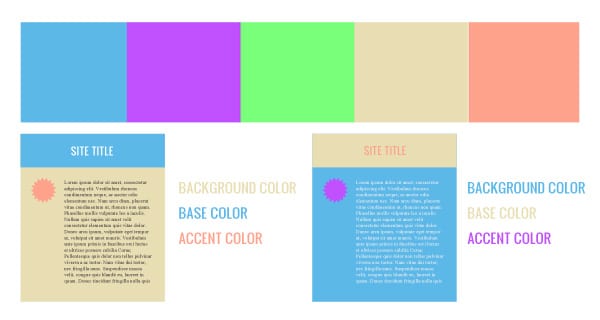
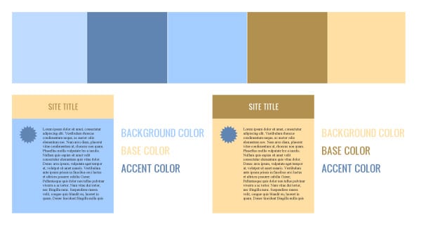
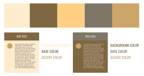
Now that you have your color scheme let’s get practical and stick it on a site. At the most basic level you’ll need to identify three colors from your palette.
Background Color
This color is used the most and sets the general tone and feel of the site.
Base Color
This color is used to break up the background and is typically the baritone, the middle child, neither boring nor flashy but the glue that holds it all together.
Accent Color
This color is used the least but gives the site its personality. Unless you’re using a monochromatic color scheme, your accent color will have a stark contrast to both your background and your base color. This is typically your boldest color.
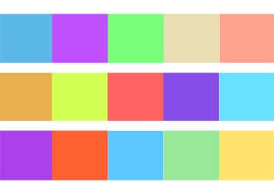
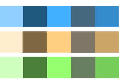
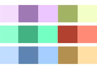
Below you’ll see several examples using our color palettes. These are obviously not the only ways you can do it, but you should get a good idea of what you’re looking for.
Analogous Example
Complementary Example
Monochromatic Example
Lastly, I want to leave you with some real world examples. Armed with your new knowledge, next time you’re browsing a gallery of sites look for the background, base, and accent colors – not only will you see how the color design was put together, you’ll start to recognize patterns and combinations that work together!
If you want more help figuring out the color scheme of a site, upload a screen shot to Adobe Kuler using the “Create from Image” option. It will create a palette of colors that you can further refine.
